
breathing life into succulence
Crafting a more enticing, intuitive, online shopping experience.
overview
Succulence is a local plant shop in San Francisco. Due to Covid-19, they've had to shift their business online. They have over 200+ plants in their inventory, however, their ecommerce site does not have any way for shoppers to sort or filter through them all. There’s also a weak navigation system implemented that causes users to feel lost and confused. My goal for this project was to find a way to improve the information architecture and make the site more intuitive for shoppers to navigate.
what we were asked to accomplish:
Present an interactive prototype of a desktop ecommerce website to the class, minimum 20 screens, focusing on improving the navigation and information architecture.
scope: type:
2 Weeks. Student Project
my process
steps
Plan
Design
Test
Iterate
Deliver
tools
Pen & Paper
Adobe Illustrator
Adobe XD
Mirro
how i created
Organizational research
Competitive Analysis
User research screener, script, data and results
Affinity diagrams
Persona
User journey
Scenarios
Content inventory - 50 products
Sitemaps (influenced by card sorts)
User flows
Sketches
HiFi Wireframes
Prototype
Usability test screener, script, plan

speaking to the right audience and documenting what they shared:
Using a screener survey, I posed a qualifying question in order to better understand people’s plant purchasing habits.
“How often do you purchase indoor plants for your home?”
With this screener, I was able to qualify interview participants that directly replicated Succulence’s target audience. Using these people’s experiences and stories, I used a series of exercises (left, for example) to gain a better understanding of their pain points, behaviors, needs and goals.
giving a face to the data
Next, I aggregated the data of the users from my interviews and personified my research to create a User Persona.
By focusing my design around a specific user’s behaviors, needs and frustrations, I was able to address many problems within the current site that were undermining the user experience.

meet tanna.
Goal: Tanna wants to easily browse and select plants that fit her personal needs.
Pain-Point: She is ill-informed on different varieties of plants and their needs and feels frustrated that she can’t make an informed purchase.
Behavior: She prefers to shop local and in-person if possible. She has 4-5 plants already, but wants to add to her collection.
Need: She needs to feel confident and informed in her online purchases since she cannot go in-store due to Covid.
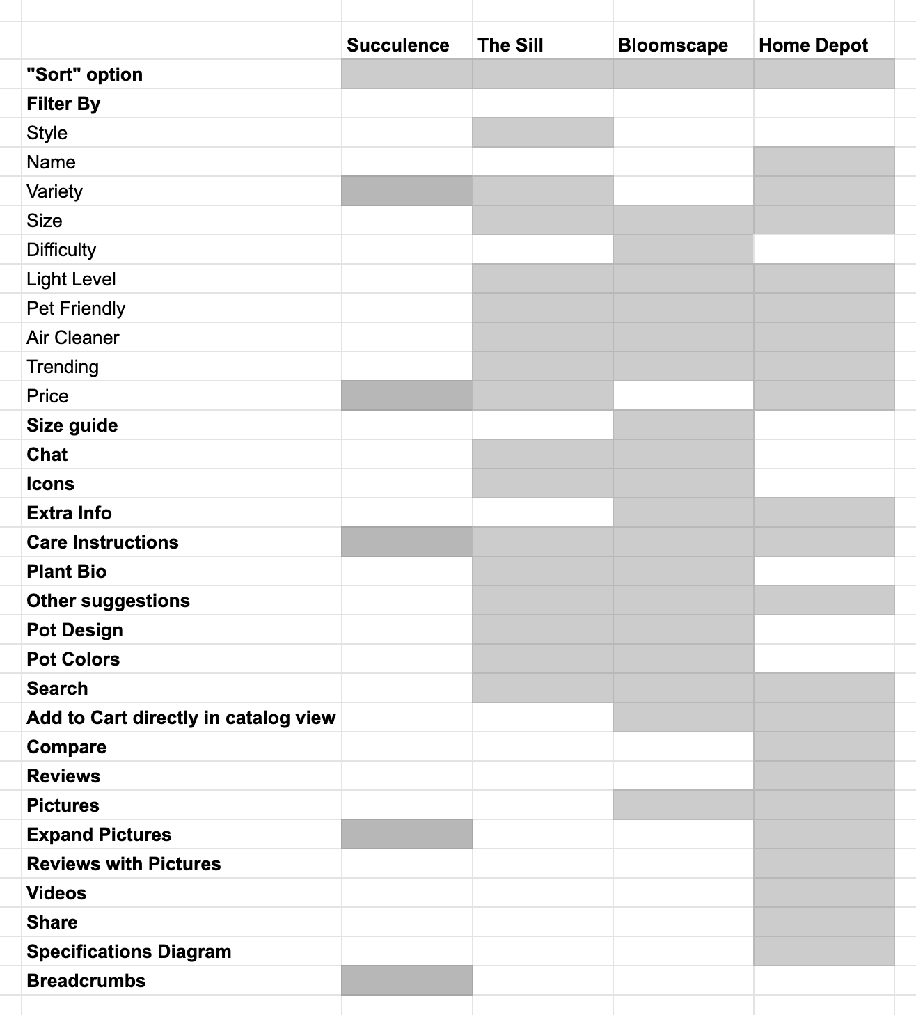
analyzing the competition:
To ensure that Succulence was competing in the marketplace, I did a feature inventory on its biggest competitors which I determined from domain research and user interviews. Because Succulence is locally owned, it faces different and often larger challenges than big-box plant retailers do. As you can see from this chart, the current website was not doing itself any favors in keeping up, meaning that users were left with a heavy load when trying to use the site.
problem areas I located and took action on:
While succulence sells many different types of things such as gardening tools, jewelry, seeds, greeting cards and home decor, the purpose of this project was to focus on the Information Architecture of 50 products. I chose to stick to just the plant inventory because plants are Succulence’s main product, therefore they needed the most help. Some of the main issues for Tanna with the current site as is are:
There is virtually no organization
The Product Inventory is overwhelming
There are no filter options
The site provides no guidance or icons to show plant qualities that fit Tanna’s needs.
solving the problem and designing with Tanna’s pain-points in mind:
To solve for Tanna’s problems this is what I focused on:
Organizing plant inventory in an intuitive way
When plant shopping, Tanna doesn’t always have a specific plant in mind. It just needs to check the boxes. Still, she wants to be able to browse and not feel overwhelmed and confused with all the different options.
Making it easy to filter through products that fit Tanna’s needs, such as level of difficulty to maintain and water level needed.
Tanna knows she needs a plant that is hardy, easy to care for and fits her aesthetic preferences. Helping Tanna easily locate plants that fit these characteristics will improve her user experience.
Providing enough information about the plant that Tanna feels confident in her purchase.
Plants can be expensive, so it’s unlikely Tanna will take the time and spend the money to purchase a plant that may or may not work for her. To keep her engaged and avoid her from dropping off the site, Succulence needs to provide enough information to inform her purchase.
the outcome
reimagined home screen

before
Currently, Succulence’s home screen is cluttered. Because the site uses dated formats and colors, the site is displeasing to the eye. Both of these things cause cognitive overload for users who start their user journey frustrated with uncertainty of where to go.

after
This reimagined design simplifies and restructures the main elements of Succulences home screen and makes navigating the website a breeze. The logo is a proper size compared to other elements and colors are used properly to denote a call to action.
intuitive organization and filtering

before
One thing you couldn’t knock the current Succulence product inventory page for was its simplicity. While the interface looked clean, it lacked all the information needed for users to make an informed purchase. With just the Genus name and price, there was no way for an average plant owner to navigate the site confidently.

after
To truly be able to compete with other plant vendors in the marketplace, Succulence needed to beef up their filtering and sorting functionalities. I decided to implement these features in many different ways throughout the interface to make sure that all user needs could be accounted for. Note all the different options available between both functions. I also implemented an icon feature so the users could make quick visual notes of plant characteristics without having to click on the plant and go to the product page to learn more.
sufficient information

before
Once the user finally makes it to the plant product page, they’ll find a description of the plant and the types of conditions it thrives under. Shopping in this website is a guessing game for the user until they finally land on something that fits their needs. Because there are no quick indicators, the user has to read the description of every plant to find out their qualities.
after
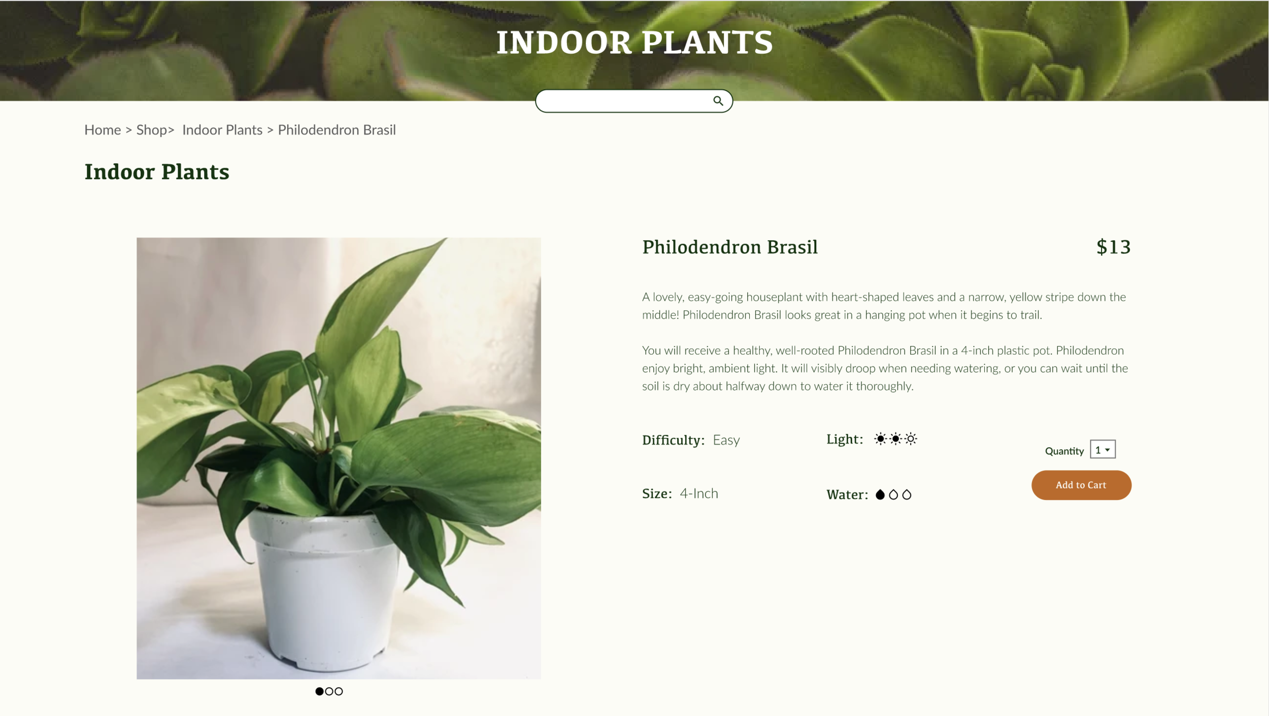
In the redesign, the interface follows a 12-grid system, which allows for lots of space and breathing room for information. Not only did was the User able to filter through plants by quality to find a plant they’re interested in clicking on, but once they do, it’s easy to see the difficulty level, light level, size and water level of the plant. The call to action is clear to see and there are more pictures of the plant to view.
user testing
Task: Because this is an e-commerce website, the task I chose to test the usability of my prototype was selecting a product (a Philodendron Brasil), having the user add it to their cart, then to check out. Because Succulence has multiple locations, I prompted users to use the Bernal Heights location, and pay upon pickup.
Goal: Complete task in under 2 minutes.
Results: 2/3 users were able to complete the task on time.
Outcome: The name of the product affected and confused all users. Also some click locations weren’t as intuitive enough.
Future Iteration: Build out search function, clean up zoom feature in the product page, take titles AND photos of the product clickable.
challenges
The site only had listings of each plant by Genus name, not familiar name which confused users when they attempted to find a plant by name.
The current site doesn’t explicitly list out plant qualities, so I had to do my own research on each of the products to make sure I could provide enough information that users could find what they needed.
Because of these challenges, the depth in which I could actually transform the user experience was limited.
why it works:
Currently, larger online plant retailers like The Sill and Bloomscape dominate the market. By implementing a sort option, Succulence provides a way to sort by price, what’s new and by alphabet to compete with the market. The main sell of the redesign though, is that there is a filter feature that sorts the inventory by common characteristics people such as Tanna use to qualify a plant for their home. Users like Tanna will opt for easier to navigate retailers if their needs are not met, and these simple IA redesigns solve for these pain points.
Previously, Succulence had a very outdated UI which potentially deterred users by building frustration and failing to build consistency and trust. With the refreshed UI, there is still solid brand familiarity, but with a more updated and easier to navigate interface.