
reimagining the connection between the Chicago community and its news source
Delivering ABC7 Chicago to its readers in a pivotal way in the midst of a global pandemic.
overview
In the world of social media, ABC 7 Chicago is having difficulty retaining readers on their site. In light of Covid-19 stay-at-home orders, they’d like to foster more of a sense of community for their users by reprioritizing local news. My team's goal was to find a way to make the site more engaging and community oriented while keeping big-ticket stories in their rightful place: front and center.
what we were asked to accomplish:
Redesign and present an interactive prototype of ABC7Chicago to the class, minimum 20 screens, focusing on improving the responsive design, in a mobile-first approach.
scope: type:
1.5 Weeks. Student Group Project
hypothesis
A more organized content hierarchy, quick access to relevant information, and a new means of interfacing with the website will help speak to a wider range of users, while more data-generating options will help the marketing department retain them.
team
Adrian Kung (UX Research, Visual Design)
Nathan Tufts-Brown (UX Research: Lead)
Lionel Hill (UX Research)
Alex Rowley (UX Research, Visual Design)
my process
steps
Plan
Design
Test
Iterate
Deliver
tools
Pen & Paper
Zoom
Figma
Mirro
my roles
User research screener, script, data and results
Affinity diagrams
Scenarios
Content inventory
Sketches
HiFi wireframes
Prototype
Usability testing

speaking to the right audience and documenting what they shared:
Using a screener survey, we posed a qualifying question in order to better understand people’s news consumption habits.
“How often do you read the news?”
With this screener, we were able to qualify interview participants that directly replicated ABC7 Chicago’s target audience. Using these people’s experiences and stories, we used a series of exercises to gain a better understanding of their pain points, behaviors, needs and goals.
giving a face to the data:
Next, we aggregated the data of the users from our interviews and personified our research to create a User Persona.
By focusing our design around Louie’s behaviors, needs and frustrations, we were able to address many problems within the current site that were undermining his user experience.

meet louie.
Goal: To improve his news experience overall by easily accessing relevant stories throughout the day on different devices
Pain-Point: Louie is having difficulty finding relevant-to-him, local news on preferred news site. He wants more information related to his neighborhood, but finds it’s lacking.
Behavior: Louie checks the news frequently to stay up to date with current events. He consumes NPR’s new podcast for this purpose as well.
Need: Louie needs a way to get all the news he needs on a local, national and international level in one place. he must be able to access it on the multiple devices he uses daily.
problem areas we captured and took action on:
Through a series of tried-and-true research exercises, we were able to hone in on some key user behaviors, frustrations and goals.
Louie wants news on a local, national and international level.
He likes engaging with the news in different ways and on different devices
He wants to learn about local events and stay engaged in the community but his local news source doesn’t always deliver quality information.
From these insights, we came up with an official problem statement to inform our designs:
problem statement:
“Louie wants to be able to trust his news source and access it using different digital mediums. He needs a system that provides both local and international content in an accessible, timely way so that he can stay up to date with relevant topics and remain engaged with the community.”


solving the problem and designing with louie’s pain-points in mind:
Our hypothesis was that if we crafted a more organized content hierarchy, quick access to relevant information, and a new means of interfacing with the website, we would be able to help create a user experience that kept users engaged. Some features we hoped to implement were:
A responsive website across desktop and mobile for a seamless experience, anywhere
Bookmark feature, so users could remain engaged throughout the day
Audio feature, so users could listen AND read the news
New community, election and coronavirus sections
A new sleek grid system
Clear local, national, and international sections

solving for multiple devices
We decided to go from a “tiny tweak” responsive design to a “mostly fluid” responsive design to make better use of the space that we have on both mobile and desktop.
the outcome
reimagined home screen

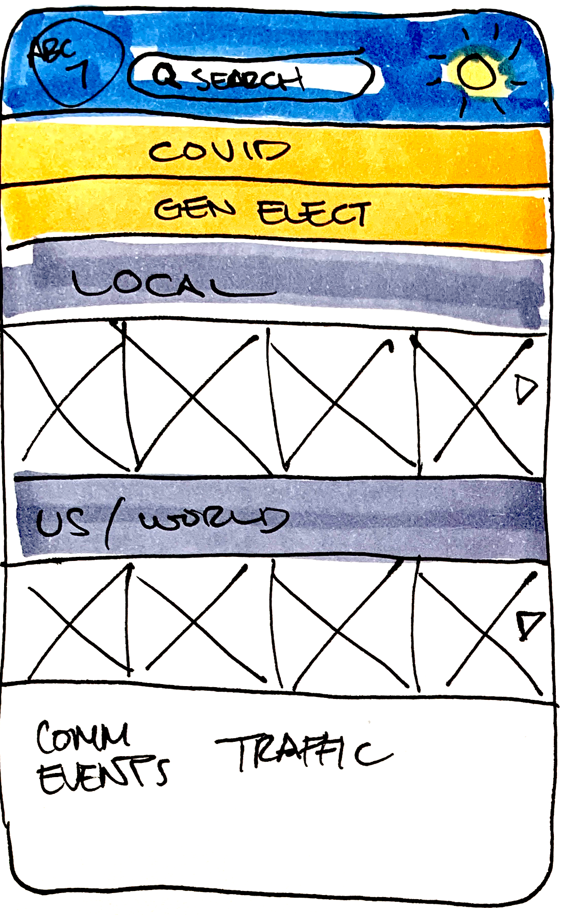
before
Currently ABC 7 Chicago’s website has many issues. As users scroll, they’re unsure where to let their eyes settle because of the lack of content hierarchy and poor content organization. Here, cognitive load is high.

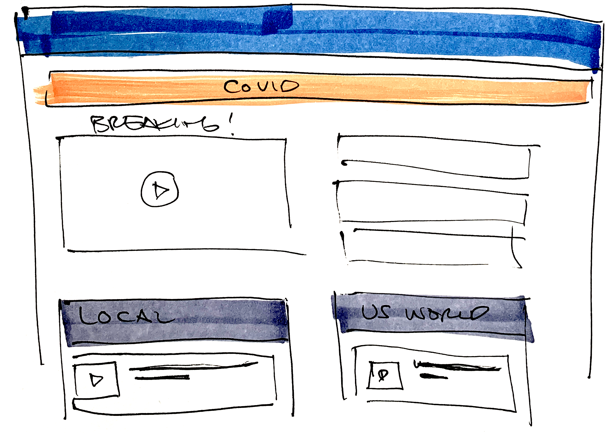
after
This reimagined design simplifies and restructures the main elements of ABC 7 Chicago’s home screen and makes navigating the website a breeze. With the allowance of negative space and reimagined site real estate, users have a clear visual journey through the home page.
updated article pages

before
In the current article page, it’s difficult to discern news content and ad content. The layout of the site is not well thought-out, leaving an entire column for social sharing that could be used more thoughtfully.

after
To solve for Louie’s many issues, I reorganized site content on the redesigned article pages. Note the bookmark feature, community event sections, and the audio player. These allow Louie to save articles and come back to them, as well as listen to them instead of read if that’s more convenient for him. For this concept project, I imaged the article page without ads and replaced the real estate with other articles to help keep users on the site.
testing the usability of the site
Because of the remote nature of this project, we administered moderated remote user tests. We handpicked 3 different users and had them complete 9 different tasks each. Tasks varied between navigating through the site, to using the bookmark feature.
Goal: Complete all tasks without failing before they’re all complete.
Outcome: 3/3 completed the tasks with minor assistance
Future Iteration:
Interactive Covid map
Accessibility Improvements
Data Trap for marketers
why it works:
Between reducing noise, designing on a grid, rethinking story placements, adding a bookmark feature and adding additional ways for Louie to interact with his news, my team made a ton of new upgrades to this website design that solves for Louie’s pain-points and improves his overall experience.
These updates aren’t just good for Louie, they’re good for ABC 7 Chicago News too, who, with this new redesign, would improve theie relationship with their readers.